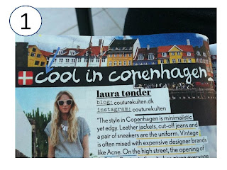
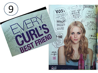
Word play is essential in the creativity exercises I play in class with my students. While on vacation, I am still on a quest to find ways to make students embrace these techniques as a way of thinking rather than just for a grade. On these summer days, the indulgence in magazine reading gave me the opportunity to spot a couple hot text trends. Word play is alive and well in magazine design. Take a look at some examples from the August 2013 edition of Company magazine, a Hearst publication.
1. Handwritten fonts
2. Highlighted text to emphasize key sentences.
3. Major underlining to make it look like its a work in progress in edit mode
4. Paint effect headlines in black ink with grainy texture
5. Asterisks that are computer generated equivalent of scribble
6. Text over notebook paper background
7. Typewriter font (see 1, 3, and 5)
8. Collaged text as if its been cu tfrom a magazine and newspaper and glued down again in contrasting and complimentary interplay with other words and images.
9. Doodles
10.Comic book hero retro text bubbles with sound effect text
Overall thoughts about the Hot Type trends from this magazine..."the grass is always greener" as there certainly seems to be a yearning to embrace simpler times of handwritten, handcrafted and even typewriter driven text in personal communication of times gone by.


No comments:
Post a Comment